Design Dossier
A Logo Has to Survive Reality
A logo is often the most recognizable part of a brand.
It is rarely the most difficult part.
The real test of an identity begins after the presentation deck is closed and the files are handed over. That’s when the logo enters the environments where it actually has to work.
A strong logo should function across a wide range of applications.
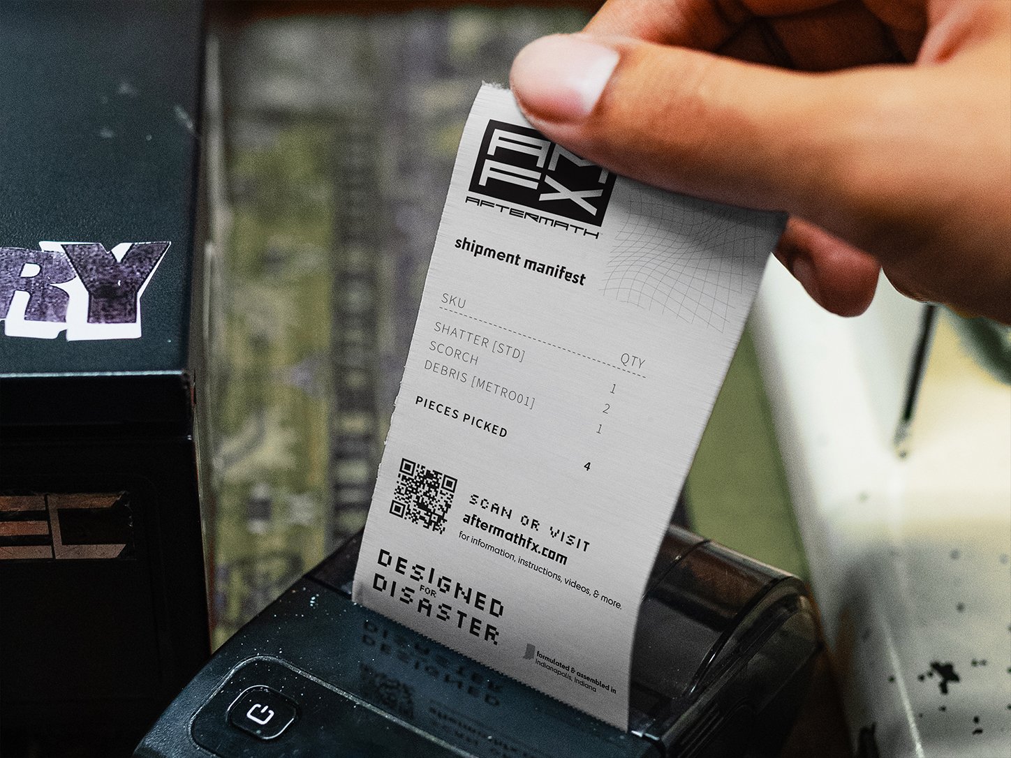
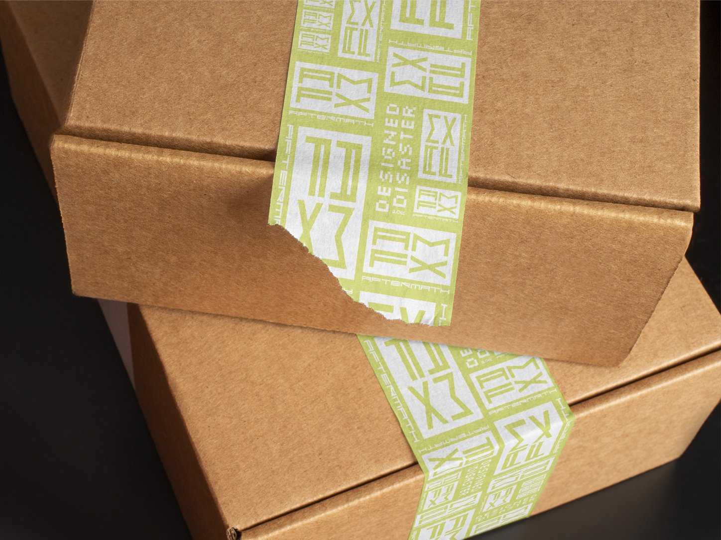
It may appear on a website header one day and an embroidered polo shirt the next. It could end up on signage, packaging, presentation slides, social media graphics, trade show displays, or promotional products produced years later by a vendor who was never part of the original project.
Each application introduces constraints.
Embroidery removes detail. Signage changes scale. Printing introduces color variation. Digital platforms compress, crop, and resize. What appears clean and elegant on a large screen may become difficult to read in the real world.
This is why logo design is only one part of a broader identity system.
Good identities are designed with flexibility in mind. They provide the tools needed to maintain consistency across different environments, formats, and production methods.
A logo should not depend on perfect conditions.
Simplicity is not the absence of thought. It’s usually the result of careful decisions that prioritize clarity, usability, and longevity.
Good identity systems account for these realities from the beginning.
They anticipate imperfect production, changing vendors, budget limitations, and the countless situations that arise long after the original project has been completed.
The most successful brands are rarely the ones that look best in controlled conditions. They are the ones that continue to function when conditions are less than ideal.
Eventually, every brand leaves the presentation deck and enters the real world.
The goal is not to design for the presentation.
The goal is to design for reality.
