MonitorBase
MonitorBase helps organizations monitor, maintain, and manage critical systems with confidence. The challenge was to create an identity that felt established and trustworthy while avoiding many of the familiar visual conventions found throughout the technology sector.
The resulting system balances precision with personality, creating a brand that feels approachable, capable, and built to last.

The Challenge
Two priorities emerged early in the process. First, the brand needed to feel more human. Second, MonitorBase wanted to stand apart in a category where many competitors were converging on similar visual cues without chasing trends that would age quickly.
At the same time, the company carried meaningful internal history. Any evolution needed to respect that legacy while positioning the brand for its next chapter.
The Approach
The identity refresh was guided by the idea of honoring the past while preparing for the future. During early conversations, the MonitorBase team shared the story of a hand-blown glass whale purchased during a company trip to mark a significant milestone. The pride and meaning attached to the sculpture made it a natural source of inspiration, representing resilience, navigation, and growth.
That story became a useful lens for the work. Rather than introducing an entirely new narrative, the refreshed identity drew from something the organization already valued.
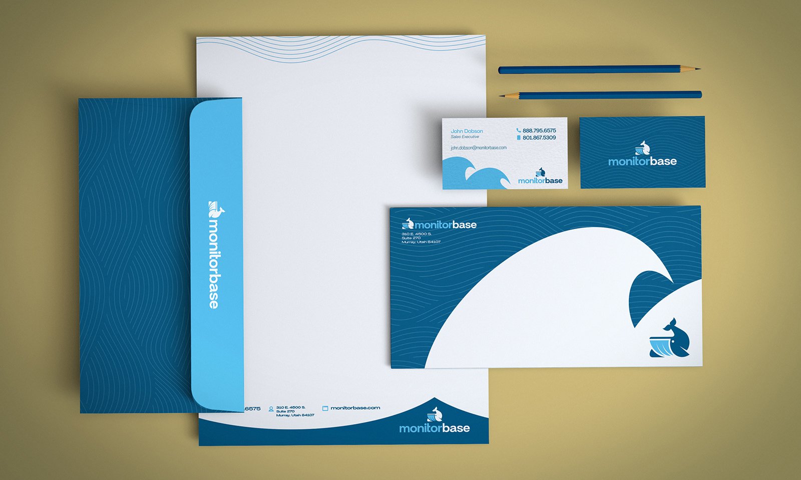
Identity System
The identity centers on a custom whale symbol derived from the sculpture that inspired the project. Designed to be simple, recognizable, and adaptable, it serves as the foundation of the broader visual system.
Typography, color, and supporting graphics were refined to create a clearer hierarchy and a more cohesive presence across applications. Together, the elements provide structure without overwhelming the content they support.


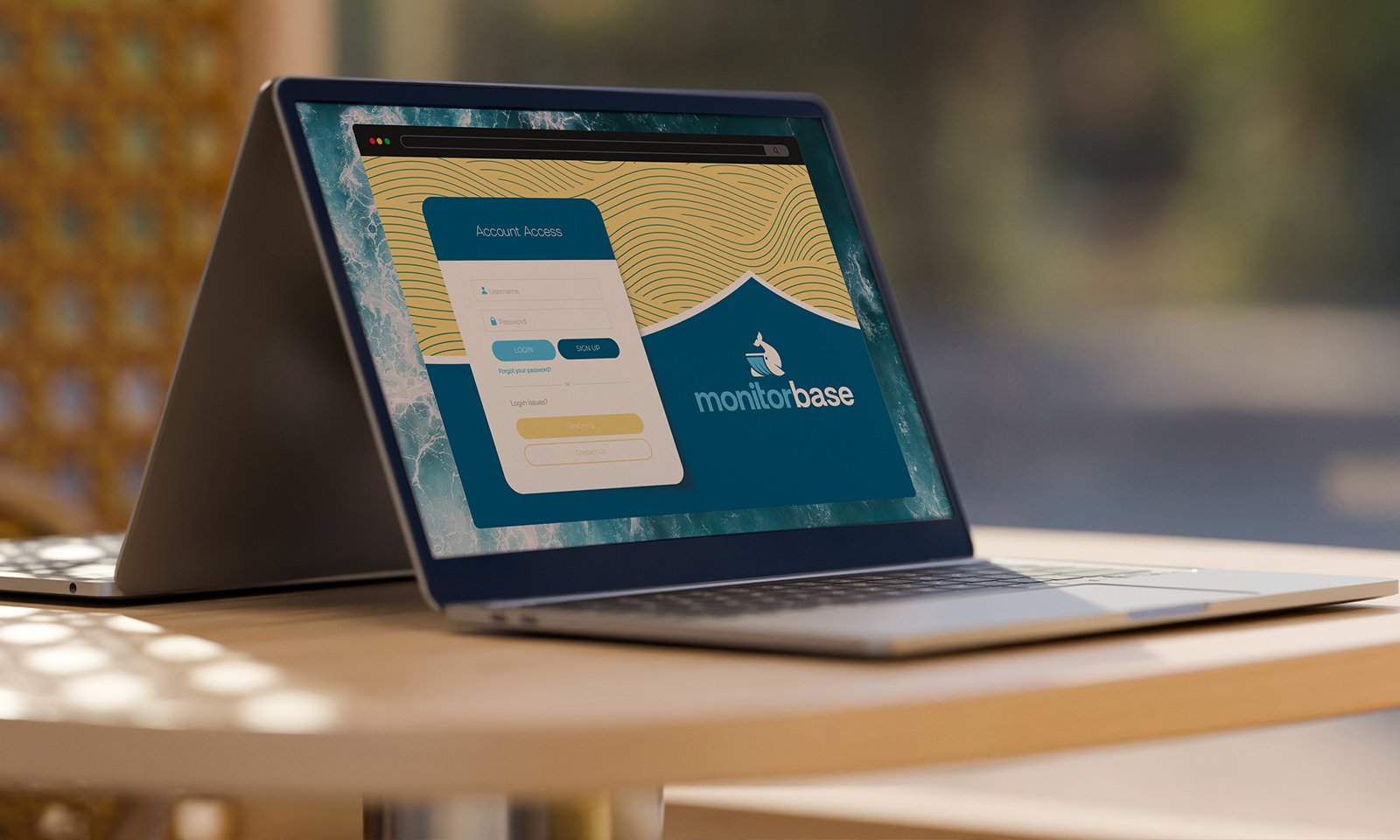
The Real World
A brand rarely exists in one place. It appears in software interfaces, presentation decks, conference materials, internal communications, signage, and countless everyday interactions.
The MonitorBase system was designed with those realities in mind. The goal was not to create a logo that looked good in isolation, but an identity that remained recognizable wherever it appeared.
Brand Expression
The visual language favors restraint over novelty. Clean typography, thoughtful spacing, and a focused palette allow the brand to communicate clearly without relying on decorative elements or visual noise.
The whale symbol provides recognition. The supporting system provides consistency. Together, they create a brand that feels distinctive without demanding attention.

Impact
The rebrand gives MonitorBase a more distinctive presence while remaining grounded in the values and history that helped shape the company.
By building the system around a meaningful piece of the organization’s story, the identity feels authentic rather than imposed. The result is a durable brand framework that can continue to evolve while remaining recognizable over time.